
Data Visualization for Military History
assignment by Charles Hannon
This assignment is designed to empower students to use tools of data analysis to better understand the lives of veterans and tell their stories. Data Science is not the enemy of historians or of the humanities generally, is not “a return to the age of mystery,” as this recent mini-controversy posited. Understanding how to locate, understand, and visualize data can help students discover important issues affecting veterans lives today and lead to new areas of research in the future.
This assignment comes from an Information Visualization class that I teach. The course is not about military history, but in Spring 2021 one of my students, Chandler Bell, used my assignment on creating information dashboards to explore data related to veteran populations in the U.S. I’ll describe here, in some detail, how to create this dashboard in the hope that teachers of military history might include similar assignments in their syllabi and thus empower their own students to adopt the tools of data science as they learn about, and tell, the stories of military veterans.
When I teach the process of information visualization, I follow Ben Fry’s useful 7-part framework, outlined in chapter one of his book Visualizing Data: Acquire, Parse, Filter, Mine, Represent, Refine, Interact.
1. Acquire. “Obtain the data, whether from a file on a disk or a source over a network.”
Websites change frequently. As of this writing, the way to find veterans data at the Census Bureau website is to locate their “Explore Data” section, and find their advanced search tools. The advanced search page looks like this:

NOTE: A complete Excel file with the data needed to create this dashboard is available here.
1. Under “Browse Filters,” click Topics\Populations and People\Veterans.
2. Under “Geography,” click State\All States in the United States.
3. Click Search. A page like the following is returned.

The Census Bureau collects a lot of information about veterans, as you can see from this list of tables. Clicking the first link to Veteran Status returns a page like the following:

The top-level Veteran Status table contains almost all the information collected about veterans: period of service, sex, age, race and ethnicity, income, education level, etc. This is a rich source of information to explore, but to keep this sample assignment simple, I’m going to focus on veterans’ gender in each state, so I’ll click the second link, to the table, “SEX BY AGE BY VETERAN STATUS FOR THE CIVILIAN POPULATION 18 YEARS AND OVER.” Also note that you have the option (top right) of getting 1-year or 5-year data estimates. In general, 1-year estimates are more current but less accurate, 5-year estimates are less current but more accurate. I would typically download the 5-year estimates.
1. Click the table you want.
2. Click Download.
2. Parse. “Provide some structure for the data’s meaning, and order it into categories.”
3. Filter. “Remove all but the data of interest.”
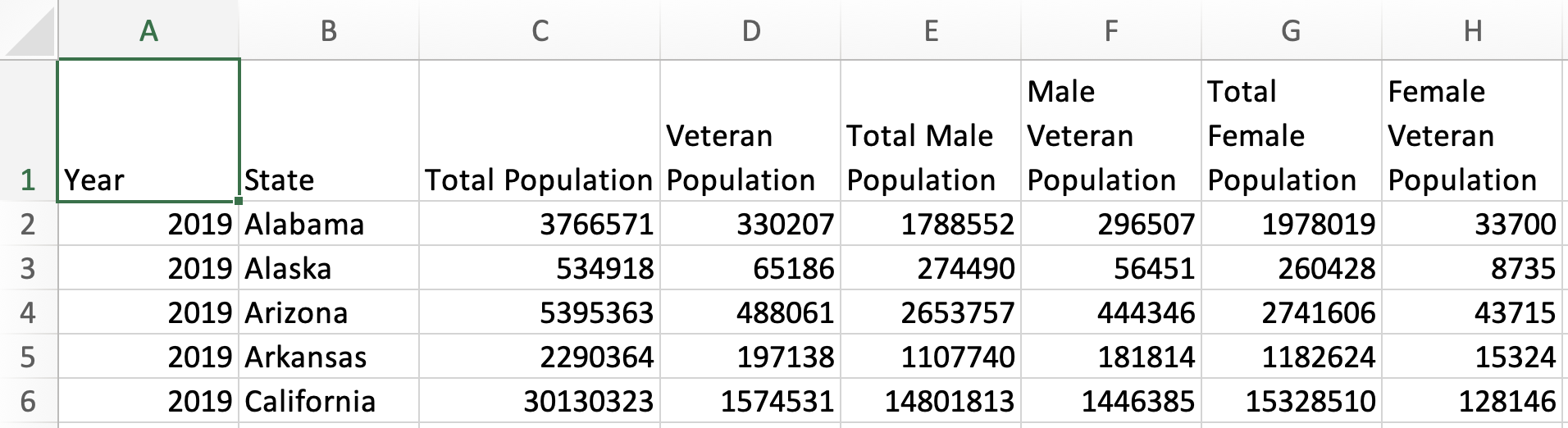
I combine these two steps in this discussion because they are both about preparing a data file for use in a visualization tool. I would typically counsel students to retain the original download files, which include canonical Census categorizations and files with metadata (information about the data), and to use copies of these files to prepare a file for visualization. Here is what the first few rows of the original download of the 2019 5-year estimates for the table “SEX BY AGE BY VETERAN STATUS FOR THE CIVILIAN POPULATION 18 YEARS AND OVER” looks like:

And here is what my parsed and filtered file looks like:
Now here’s the boring part: repeat this process for each of the years of data available at the Census Bureau. It is possible to download them all at once, but they do not download as a combined file, so you have to do a lot of copy and pasting (carefully!) to get the data you want, in the form you want, for each year you want.
4. Mine. “Apply methods from statistics or data mining as a way to discern patterns or place the data in mathematical context.”
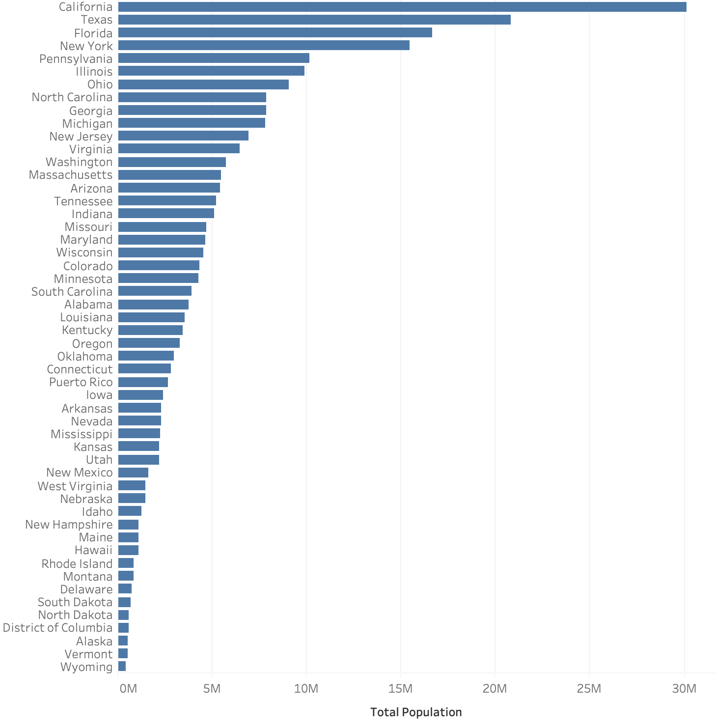
Sometimes, raw numbers can tell an interesting story. For example, the visualization below shows that in 2019, the five states with the largest populations of veterans are California, Texas, Florida, Pennsylvania, and Ohio.
But often, a visualization such as this is little more than a population map: these states have the largest populations overall, so it makes sense that they also have the largest populations of veterans. A more interesting question would be, Which states have the highest populations of veterans as a percentage of their total populations? Answering this question requires a simple percentage calculation, which can be done either in Excel or in a visualization tool such as Tableau.
1. In Excel, you can enter the formula =(D2/C2)*100 to create a column showing “% Veteran Population.”
2. Double-click the black cross at the bottom right of the cell to repeat the formula down the entire column.
The Excel file now looks like this:

And now we can see that the states with the highest percentages of veterans relative to their overall populations are Alaska, Virginia, Montana, Wyoming, and Maine.

Similar simple statistical formulas can be used in the Excel file to create percentages for men and women veterans in each state, but I will show how to accomplish this within Tableau instead.
Tableau is primarily marketed as business analytics software but it makes the visualizing of any kind of data relatively easy. More importantly, it allows for exploratory data analysis, when you are not sure what patterns reside in your data or want to run a lot of “what if” scenarios with it. Tableau offers its software free to college teachers and students and has a lot of online video training to learn both basic and advanced features (I highly recommend the “Getting Started” videos).
When you open Tableau for the first time it looks something like this:

1. Links to training videos are at the top right of the screen.
2. To connect to the veterans Excel file, click the “Connect to Microsoft Excel” link at the top left of the screen, and then browse to the Excel file on your computer. The software loads the data and loads a screen like the following:

1. In any data-related system, it is important to “type” the data correctly. In this case, Tableau automatically understood that my State column contains geographic data (indicated by the globe icon), but it is interpreting my dates as numbers rather than date information. So this needs to be manually typed as Date data.
2. If you then click the Sheet 1 tab at the bottom of the interface you are taken to the basic tableau data interface.

This is the Tableau interface with a basic timeline visualization showing that the percentage of the U.S. population who are veterans has declined from 9.8% in 2010 to 7.2% in 2019.
1. The area at left is where the data categories from the Excel file are located. They can be dragged into the visualization pane.
2. For example, I dragged the Year “pill” to the Columns field at the top of the screen to create the timeline.
3. I also created a Calculated Field (Analysis\Create Calculated Field), shown at bottom, to calculate the average for each year for the entire U.S. I then dragged this Calculated Field (titled “% Veterans in U.S. Population") to the Row field at top.
5. Represent. “Choose a basic visual model, such as a bar graph, list, or tree.”
Thus far, I have chosen bar graphs to represent each state, and a timeline to represent change over time for the entire U.S. Tableau has many visualization options and one can research best practices for visualizing different kinds of data through a number of resources. The text I use in my class is Show Me the Numbers by Stephen Few. One example: timelines are interesting because they show change over time, but they are not necessarily the best choice for showing specific numbers. Sometimes a plain old table is best for this. For instance, here are the 10 states with the largest percentage point decline in veteran populations over the past ten years, represented in tabular form:

This kind of exercise can provide opportunities to discuss quantitative representations in general: What does it mean that New Jersey’s number here is -36.75%? In 2010, 7.37% of New Jersey citizens were veterans; in 2019, 4.66% were. So, 4.66% represents a 36.75% decline in the percentage of NJ citizens who are veterans over the 10-year period. (The 2010 column is 0% in each case because I used a “percent difference” calculation and 2010 is the first year of data available—so, no difference from any previous year).
6. Refine. “Improve the basic representation to make it clearer and more visually engaging.”
Tableau has many “best practices” for data visualization built in, such as color choices, fonts, shading, etc. Most refinements are centered on making sure the visualization is readable—do the axis labels make sense, do any added annotations help convey the meaning and story of the data more clearly, etc. These take practice and can be learned from texts like Few’s, referenced above.
7. Interact. “Add methods for manipulating the data or controlling what features are visible.”
Sometimes these refinements are related to making the graphic easier to interact with. For example, it is easy to create a map in Tableau. For example, here is a visualization of the U.S. with each state colored according to the percentage of women veterans:

This map makes it clear that Alaska and Virginia have the largest populations of veterans per capita, but this kind of map is difficult to interact with. It would be difficult to click on Delaware, for example, to get more information about that state in particular. This is why the dashboard at the beginning of this page uses a hex map to display the data. Hex maps have the disadvantage that they are inaccurate geographically, but they have the advantage of allowing a user to select each state to get more information about it.
In the video below, I will talk through the process of making the hex map dashboard in its entirety. Below the video, I will link to any files or other resources that you would need to re-create the dashboard yourself.
Links and files referred to in this video:
· Excel file with Veterans Populations data
· Excel file with hex map data
· Link to tutorial on creating a hex map
Finally, here is my Tableau file in “packaged workbook” format. This has both the Tableau file and the data bundled together. If you have Tableau on your computer, you can open this file and see how each of the visualizations was created.